Case Study
Howard Simmons Law
A dated 2018 law-firm website rebuilt into a clearer information system with structured practice areas, SEO-friendly service content, protected forms, and easier consultation paths.
Project Snapshot
Overview
What the project needed to make clear.
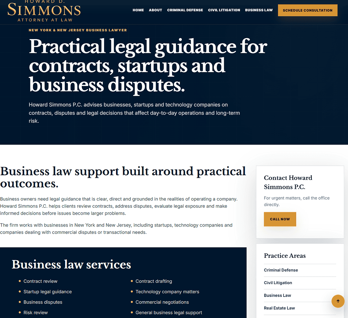
Howard Simmons Law came to FultonStudio with a site that dated back to August 2018 and felt frozen in that period. The old site had dated information, weak page structure, dense copy, limited SEO-friendly service content, and no modern form-protection layer. It did not give potential clients a fast way to understand the firm, choose the right legal matter, and reach out confidently.
FultonStudio rebuilt the site as a modern information-based system. The new structure separates practice areas, gives visitors clearer paths into criminal defense, civil litigation, business law, real estate law, appellate advocacy, immigration law, and related legal services, and supports each section with direct calls to action. The goal was not only to make the site look newer. It was to help clients find the right information quickly, read enough to make a decision, and contact the firm through a safer, clearer consultation flow.
Challenge
The previous site was built around an older 2018-era presentation. It had dated information, a flat structure, limited search-friendly service content, and no modern form-security layer. Visitors had to work too hard to understand the practice areas or know which next step to take. From a support and security standpoint, the contact path also needed to be hardened before it became a larger problem.
Strategy
FultonStudio reorganized the site as a practical legal information system. The new direction gave the firm a clearer homepage, stronger proof points, dedicated practice-area paths, easier sidebar navigation, clearer legal disclaimers, and consultation forms designed to move visitors from reading to action without making the experience feel confusing or overloaded.
Result
Howard Simmons Law now has a more credible, easier-to-navigate web presence. Visitors can scan the practice areas, open the section that matches their legal matter, read the information they need faster, and reach out through protected consultation forms or direct phone CTAs. The site now supports decision-making instead of forcing users through a dated brochure-style layout.
Work Completed
What FultonStudio changed.
The work included modern website design, page-structure planning, practice-area organization, service-specific copy direction, SEO-friendly headings, improved internal navigation, CTA planning, consultation form flow, legal-disclaimer placement, Cloudflare Turnstile form protection, mobile-responsive layout cleanup, and a clearer path from practice-area content to contact.
Project Images
Before, after, and supporting visuals.
A tighter image grid keeps the page clean. Captions open inside the lightbox instead of crowding the thumbnail layout.
More Case Studies
Keep looking through the work.
Return to the full case study archive or move through another project example.
View All Case StudiesApply This Thinking
Want the same kind of clarity on your website?
Start with a website audit if you want a first read, or send a service request when you are ready to talk through the project.
1. Review
I am not sure what is wrong.
Start with a quick review of your current site. It can show whether you need cleanup, care, or a deeper rebuild.
Start Website Audit2. Request
I already know what I need.
Send the website URL, what feels wrong, timing, and any notes you already have. FultonStudio can reply with a clearer first read.
Send Service Request